My inspiration for the design is to celebrate the 10th anniversary of same-sex marriage in the U.K.
Within the LGBTQIA+ community, the colour purple holds great significance.
In the language of flowers, or floriography, purple flowers symbolise dignity, pride, and success. They are often associated with deep emotion, introspection, and spirituality.
In the early 19th Century, violets were worn by lesbians as an homage to the poet Sappho who lived on the island of ‘Lesbos’. Following that, during the 1940’s the term ‘lavender’ was associated with gay men.
Since then, the additional introduction of purple symbol into the Progress Pride flag represents the intersex community. (Double purple yay!)
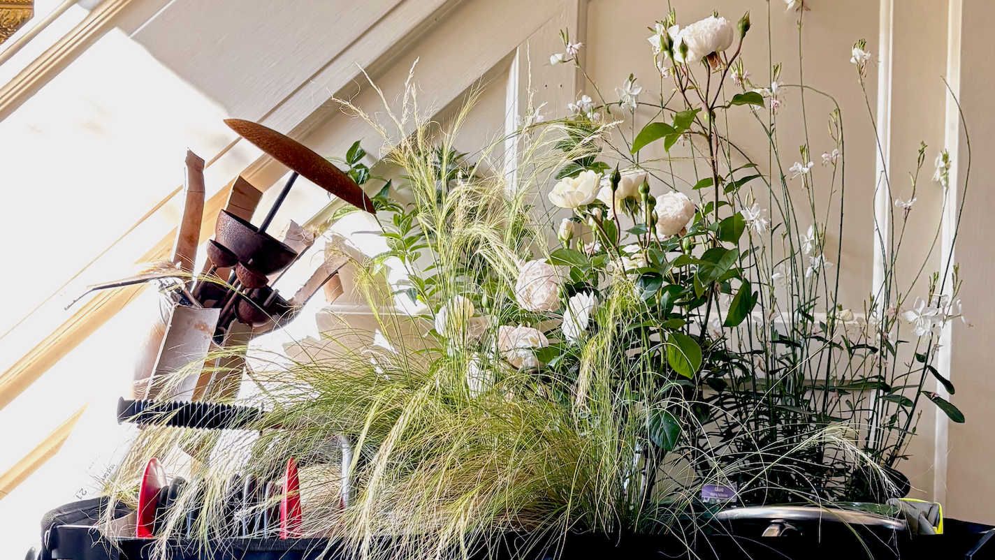
The cast iron ornaments you see displayed in my border are to signify the 10 years of progress that the community has made and continues to make.
White, purple and orange have always been a great colour combo in my opinion.
Standing among them is a rainbow rock monolith to represent the strength and tenacity of the queer community.
I’ve specifically chosen a variety of pollinating plants so the bees, butterflies and insects can go mad but also stop for a drink after all their hard work.
My colour palette was extremely important to me and I wanted to create a cool, calming border with lots of seasonal interest as well as a pop of bright colour with the Salvia x jamensis ‘Nachtvlinder’
A number of people came up to me and described my border as “classy” which is exactly what I was hoping to achieve.
Overall, this has been a wonderful experience, I wouldn’t have a changed a thing. Exhibiting alongside such talented, young designers was really refreshing also and their work is something to applaud!
So, on to the next!??
